This Sunday marks #ShowYourStripes Day, a global campaign that uses a simple but powerful visual to start conversations about climate change.
Created by Professor Ed Hawkins at the University of Reading, the “warming stripes” show how temperatures have changed over time. Each stripe represents a year. Cooler years are shown in blue, warmer years in red. Looking from left to right, the gradual shift from blue to deep red tells the story of a warming climate.
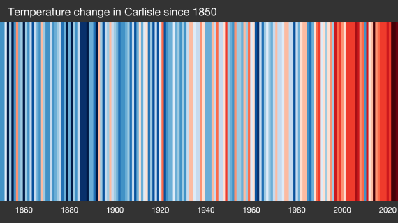
Thanks to Professor Hawkins, we now have a special set of climate stripes for Carlisle, created following a request from Futureproof Cumbria. Carlisle was chosen because it has a long history of weather records and provides a useful picture of how our local climate has changed over time.
The pattern is unmistakable. While individual years vary, recent decades are dominated by red stripes, showing that warmer-than-average years are becoming increasingly common. This mirrors trends seen across the UK, where recent years have been among the warmest on record. In fact, 2025 was officially the UK’s warmest and sunniest year since records began, continuing a clear long-term warming trend.
Closer to home, many people will have noticed changes in Cumbria’s weather. Hotter summer days, warmer winters, more intense rainfall events and longer dry spells are all becoming more familiar. While weather naturally varies from year to year, climate records show that the overall direction of travel is towards a warmer climate.
The beauty of the climate stripes is that they need no specialist knowledge to understand. There are no complicated graphs, statistics or technical terms – just a striking visual reminder of how much our climate has changed within the lifetime of many people living today.
This #ShowYourStripes Day, take a moment to look at Carlisle’s stripes, share them with friends and family, and start a conversation about what climate change means for Cumbria and the actions we can all take to help build a more resilient future.